
Motion That Means Something: Feedback, Focus, and Flow
There's one line in the useLayouts docs that I think about more than any line of code I've written.
"Every animation here is supposed to do a job: feedback, focus, or flow. If it only looks expensive, cut it."
That's the whole philosophy. Everything else in the library comes out of it. Which components exist, how long they animate, what moves and what doesn't, what I deleted after a week of living with it.
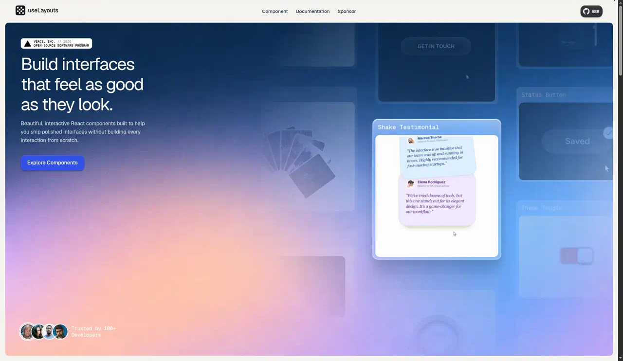
I'm Urvish. I build useLayouts, a free MIT collection of animated React components made with Tailwind and Motion, distributed through a shadcn registry. It got picked for the Vercel Open Source Program Winter 2026 cohort, which still feels unreal. But this post isn't really about the library. It's about the thinking behind it. How I decide whether a piece of motion deserves to exist, and how you can make that call in your own projects, whether you ever use a single component of mine or not.
Fair warning, this is long. I've had a lot of opinions bottled up.
The problem with "make it pop"
I think most bad motion on the web comes from one request: make it feel more alive.
That request is totally valid. Static interfaces can feel cold. But the usual response is to add motion everywhere. Fade in every section on scroll. Scale every card on hover. Bounce every button. Slide in every modal from a different direction. And the result is an interface that moves constantly but doesn't actually say anything.
It's like someone who talks with their hands so much you stop being able to tell which gestures matter.
When everything moves, nothing stands out. Your users' eyes get pulled in ten directions. The page feels busy. On slower devices, it feels janky. And the moments where motion actually could help, like telling someone their save worked, get lost in all the noise.
The fix isn't less motion, exactly. It's motion with a reason. And the reasons, as far as I can tell, come down to three.
Feedback: "I heard you"
The first job motion can do is feedback. Telling the user that something happened because of what they did.
This is the most important one, and I think the most underused. Every time someone clicks, taps, drags, or types, they're asking the interface a question. "Did that work?" Static UI answers that question late or not at all. Motion can answer it immediately.
Think about pressing a physical button. It goes down. It clicks. Maybe it lights up. You never wonder if it registered. Now think about clicking a web button that does a server request. Often nothing happens for a moment. Then maybe a spinner. Then maybe the page changes. That gap, where you don't know if it heard you, is where people double click, rage click, or give up.
Good feedback motion closes that gap.
In useLayouts, the Status Button is basically a feedback component and nothing else. You click it, and it immediately changes to show it's working. Then it changes again when it's done. Each change is animated so it feels like the same button changing its state, not three different buttons swapping places. The width animates instead of jumping. The label transitions instead of snapping. You never wonder whether it heard you. (If you go looking for it in the registry, it's the one called save-button.)
The Delete Button is feedback too, but a different kind. When you're about to destroy something, the feedback isn't just "I heard you." It's "are you sure, because this is a big deal." The motion gives that action some weight. It makes deleting feel like a decision, not a CSS class. A plain red button that instantly removes a row says "this is trivial." A delete that flips into a short countdown you can cancel says "this matters, and I'm treating it like it matters."
Here are a few feedback principles I've landed on:
Feedback should start instantly. The first frame of response should happen on the input, not after the server replies. If the click starts the transition, the user knows they were heard, even if the result takes a second.
Feedback should be proportional. Saving a form field doesn't deserve confetti. Deleting your whole account maybe deserves a pause. The size of the motion should match the size of the action. My first Status Button had a celebratory bounce on success and it felt ridiculous for saving a text field. I cut it.
Feedback should resolve. Don't leave the UI stuck in a "success!" state forever. Show it, let it land, then go back to normal. Otherwise the feedback becomes just another piece of static UI.
Feedback should be about the thing you touched. If you click a button, the button should respond. Not a toast in the opposite corner of the screen. Toasts are fine as a backup, but the main response should be right where your attention already is.
Focus: "look here"
The second job is focus. Directing attention to what matters right now.
Interfaces are full of things competing for attention. Motion is one of the strongest attention tools there is, because our eyes are wired to notice movement. That's exactly why it's dangerous to overuse, and exactly why it's powerful when used on purpose.
Focus motion says: of everything on screen, this is the thing to look at.
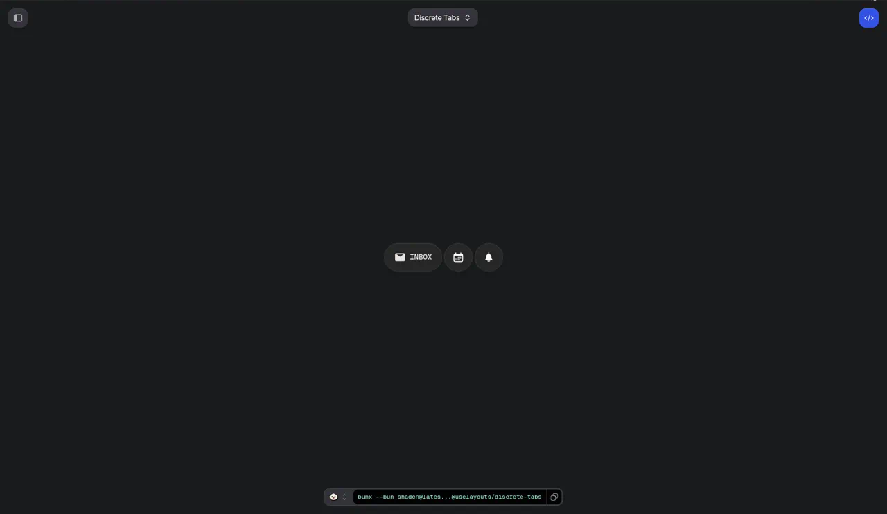
Discrete Tabs is a focus component. It's a row of pills. The inactive ones are compact, just an icon. The active one opens up to show the icon and the label. When you switch tabs, the old active pill shrinks back to its icon and the new one opens up, and everything slides to make room.
What that does is make it really obvious, at a glance, which tab you're on. Not because it's a different color, though it is, but because it's literally bigger and it has words. Your eye goes straight to it. And when you switch, the movement draws your eye to the new active tab, so you never lose your place.
A gallery that expands one image while the others recede is focus. A card that lifts slightly when you hover, while the rest of the grid stays still, is focus. A form field that subtly highlights when it's the current step is focus.
Focus principles:
Only one thing gets focus at a time. If two things are animating for attention, neither wins. Pick one.
Focus motion should be relative. It's not just about the thing that moves. It's about the contrast with things that don't. Discrete Tabs works because the inactive tabs get smaller as the active one gets bigger. The relationship is the signal.
Let focus fade. Once someone's looking at the right thing, stop pulling. In Discrete Tabs, the label blurs into focus in about 200ms and then just sits there. Nothing keeps pulsing or glowing to remind you which tab is active. It's a nudge, not a siren.
Don't steal focus without permission. Auto animating something the user didn't ask about pulls their attention away from what they were doing. That's rude. Motion that grabs focus should usually be in response to something the user did, or something genuinely important.
Flow: "here's how we got here"
The third job is flow. Connecting one state to the next so the user doesn't lose track of where they are.
This one's subtle. A lot of interfaces change state abruptly. You click a tab and the content is just different. You submit step one of a form and step two just appears. You expand a card and a full view replaces it. Each change is a tiny moment of disorientation. Your brain has to re-scan the screen and figure out what changed.
Flow motion removes that re-scan. It shows you the change happening, so your brain tracks it instead of having to rebuild the picture.
The classic example is shared element transitions. A thumbnail in a grid grows into a full view, instead of the grid disappearing and a full view appearing. Because you saw it grow, you know exactly where it came from and where it'll go back to.
In useLayouts, a lot of components lean on Motion's layout animations for exactly this. In Discrete Tabs, each pill, icon, and label has its own layoutId, so when the layout changes, Motion animates each element from where it was to where it's going. The pills don't teleport. They move. You see the old active tab shrink and the new one grow, and your brain understands it as one continuous change instead of two separate states.
The Multi-Step Form is flow too. Sliding between steps tells you that you're moving forward through something. It makes a form feel like progress instead of paperwork. Same with the Morphing Input, where an input changes shape instead of being swapped out, so you understand it's still the same thing, just doing something different now.
Flow principles:
Preserve identity. If something on screen is the "same thing" before and after a change, animate it as the same thing. Don't fade it out and fade a copy in.
Direction matters. Moving forward should feel like moving forward. If step two slides in from the right, going back should slide from the left. Inconsistent direction is worse than no motion, because it actively lies about where you are.
Flow should be fast. The point is to help you track a change, not to make you watch it. If the transition is so slow you're waiting for it, it's become the opposite of flow.
Don't animate what didn't change. If only the tab label changed, don't re-animate the whole page. Motion should map to the actual change.
"If it only looks expensive, cut it"
Okay, so every animation should do one of those three jobs. What about the ones that don't?
Cut them.
I know that's harsh. I know there's a whole genre of beautiful, purely decorative motion on the web, and some of it is genuinely art. I'm not against it in a portfolio or an experimental site. But in a product, an interface people use to get things done, decorative motion has a cost and almost no benefit.
The cost: it takes attention. It takes time. It takes performance. It adds code someone has to maintain. And it trains users to ignore motion, which makes your useful motion less effective.
The benefit: it looks expensive. That's it. It makes a screenshot or a demo video look nice.
I call it "looks expensive" because that's what it's optimizing for. The impression of polish, not actual polish. Real polish is when something feels right and you don't notice why. Expensive looking motion is when you notice the motion and think "ooh, fancy."
Here are some things I've cut from useLayouts components over time, and why.
The nervous delete button. One of my early versions of the Delete Button shook when you hovered it, like it was anxious. It was funny. It got a laugh in a demo. But it was purely decorative. It didn't tell you anything the confirm step didn't already tell you, and it would get really annoying if you were deleting things in a list. Cut.
Bouncy tab settling. Early Discrete Tabs had a much softer spring, with visible overshoot when the pills settled. It looked playful. But after a few clicks, the wobble felt like the UI couldn't make up its mind. The overshoot wasn't doing any job. It was just there. I stiffened the spring until it settled cleanly. The motion still has that springy, physical quality, but it lands.
Scroll triggered fade ins on everything. This one's not a single component, but I've definitely shipped pages where every section faded up as you scrolled. It's the most common decorative motion on the web. Does it help? Barely. On a first visit, maybe it adds a tiny sense of reveal. On the second visit, or if you're scrolling fast to find something, it just slows you down. Content you're trying to read shouldn't make you wait. I don't use it as a default anymore.
A success celebration. I mentioned this already, but the Status Button used to do a little scale bounce plus color change plus checkmark draw when something saved. Three effects for saving a form. I kept the color and the checkmark, the stuff that tells you it worked, and cut the bounce.
Gradient shimmer on hover. I had a card that had a moving gradient on hover. It looked stunning in a video. In an actual grid of cards, moving your mouse across the grid made a flickering light show. Cut.
The test I use is simple. For any piece of motion, I ask: if I removed this, would the user lose information? Would they miss feedback, lose focus, or get disoriented by a state change?
If the answer is no, and it's only there because it looks cool, it goes.
The moments where static UI is rude
The docs say these components were built for the moments where a static UI feels rude. Waiting, deleting, switching, dragging. I want to go through each one, because I think naming these moments is the most useful thing you can take away from this post.
Waiting
The user did something and now they're waiting for the result. A save, a submit, a load, a search.
Static UI during waiting is rude because it gives no sign of life. The user doesn't know if their input registered, if something's happening, or if it's stuck.
The worst version is nothing at all. The button stays the same and the page just sits there. Slightly better is a disabled state, which tells you something's happening but not what. Then a spinner, which at least shows activity.
What I aim for is waiting that feels connected. The button you clicked transforms to show it's working, then transforms again to show the result. It's the same object, telling you a story about what happened. That's the Status Button idea.
Deleting
The user is about to permanently remove something.
Static UI during deleting is rude because it treats a big decision like a small one. A red button that instantly removes a thing, no pause, no confirmation, no sense of weight, makes it really easy to make mistakes. And the browser confirm() dialog, which is the default fix, is jarring and ugly and pulls you completely out of the interface.
Good deletion motion gives the action weight without being annoying. A moment of grace that happens right there in the button. In the Delete Button, you click, the button turns into a cancel option with a countdown, and you've got a few seconds to change your mind before anything is gone. A deliberate gap between intent and action, without a modal yelling at you. That's the idea.
Switching
The user is changing context. Switching tabs, toggling a setting, picking a different option.
Static UI during switching is rude because it teleports. One state disappears, another appears, and the user's brain has to figure out what changed. It's a small cost, but people switch tabs constantly, so it adds up.
Good switching motion shows the transition. The active indicator travels. The content slides or morphs. You see where you went. That's Discrete Tabs, Vertical Tabs, Smooth Dropdown, and a lot of the navigation stuff.
Dragging
The user is physically moving something with their pointer or finger.
Static UI during dragging is rude because it breaks the illusion of direct manipulation. If you drag something and it lags, or snaps in weird ways, or doesn't respond to your speed, it feels like you're not really in control.
Good drag motion makes the thing feel like it's in your hand. It follows your pointer closely. When you let go, it settles with physics that match how you threw it. "A grip that slides" was on my original list of things I wanted, and it's still one of the hardest things to get right.
And a few more
Those four are the big ones, but there are others. Hovering, where the UI could acknowledge you're pointing at something. Revealing, where hidden content becomes visible. Editing in place, where something switches from display to input. Each one is a moment where static UI is a little rude, and a little motion can make it feel like the interface is paying attention.
Springs vs durations
Let's get a bit technical. When you animate something in Motion, you're usually choosing between two kinds of transitions: springs and tweens.
A tween has a duration and an easing curve. "Go from A to B over 200 milliseconds with this curve." Predictable, precise, easy to reason about.
A spring has physics. Stiffness, damping, mass. "Move toward B like a spring would." You don't set the duration directly, it falls out of the physics.
In useLayouts, I tend to use springs for things that move and tweens for things that fade.
Here's a real example from Discrete Tabs. The layout animation, which is the pills resizing and moving, uses a spring:
transition={{
  layout: {
    type: "spring",
    damping: 20,
    stiffness: 230,
    mass: 1.2,
  },
}}
But the label appearing inside the active pill uses a short tween with a sharp curve:
initial={isLoaded ? { opacity: 0, filter: "blur(4px)" } : false}
animate={{ opacity: 1, filter: "blur(0px)" }}
transition={{
  duration: isLoaded ? 0.2 : 0,
  ease: [0.86, 0, 0.07, 1],
}}
Why the split?
Springs feel physical. When something moves position or size, a spring makes it feel like an object with weight. It accelerates naturally and settles naturally. And springs handle interruption beautifully. If you click a new tab while the previous animation is still running, a spring just redirects from wherever it currently is, with its current velocity. A tween would have to restart or do something awkward.
Tweens are better for opacity and blur, because those don't have a physical meaning. There's no "weight" to transparency. You just want the label to appear quickly and cleanly. A short tween with a curve that's slow at the start and end, fast in the middle, gets the label from invisible to readable without lingering in that mushy half visible state.
The blur is doing a specific job there too. When a label crossfades in, there's a moment where it's semi transparent and you can kind of see it but not read it. That moment looks messy. A tiny blur that clears as it fades in hides that messiness. Your eye reads it as "coming into focus" instead of "fading in weirdly."
This is the kind of decision I think about a lot. Not "should this animate" but "what kind of animation fits what this thing is."
Picking spring values
People ask me for the "right" spring values. There aren't any. But here's how I think about the knobs:
Stiffness is how strongly it pulls toward the target. Higher stiffness means faster, snappier. Too high and it feels robotic. Too low and it feels sluggish.
Damping is how much it resists oscillating. Higher damping means less bounce. Too low and it wobbles. Too high and it feels like it's moving through syrup.
Mass is how heavy it is. More mass means it takes longer to get going and longer to stop, with more momentum. A little extra mass, like the 1.2 in Discrete Tabs, gives it a slightly weightier, more deliberate feel.
My process: start with something reasonable, then click it twenty times in a row. Not once, twenty times. Fast. Interrupt it. Spam it. Motion that feels great on one click can feel exhausting on the twentieth. If it still feels good when you're spamming it, you've got it.
How long should things take?
Durations are opinions, not laws, so take these as my opinions.
Things the user triggers directly, like a button press or tab switch, should feel nearly instant to start and should be done before the user's next thought. If they're waiting to see the animation finish before they can do the next thing, it's too long.
Things that reveal new content, like expanding a card or opening a dropdown, can be a bit longer, because the user's eyes need to travel to the new content anyway.
Things that happen a lot should be shorter than things that happen rarely. A tab bar you'll click a hundred times a day needs to be faster than an onboarding transition you'll see once.
Exits should usually be faster than entrances. When something leaves, the user is already done with it. Don't make them watch it go.
And the big one: whatever duration you pick, cut it a bit. Almost every time I've tuned an animation, the final version is shorter than my first instinct. When you're building it, you watch it closely, so you want to see it. Your users don't want to watch it. They want to use the product.
Motion should respond, not perform
There's a rule hiding inside all of this that I want to call out on its own: motion should respond to the user. If nobody did anything, nothing should move.
A real example. In Discrete Tabs, look at that label transition again:
initial={isLoaded ? { opacity: 0, filter: "blur(4px)" } : false}
isLoaded starts as false and flips to true the first time you click a tab. Before that, initial is false, which tells Motion "don't animate in, just render in the final state." The duration is also zero until you've interacted.
So when the page first loads, the tabs just appear, already settled. No entrance animation. Then once you click, everything animates.
Why bother? Because an entrance animation on page load is the component performing for nobody. The user hasn't asked it anything. It's just showing off. And on a page with a bunch of components, all of them animating on load at once, it looks chaotic, like the page is assembling itself in front of you.
Once you click, the motion becomes a response. You asked, it answered. That's the relationship I want between the user and the UI.
This isn't an absolute rule. Sometimes a subtle entrance on load is genuinely helpful, like guiding attention to the main action on an empty state. But it should be the exception you choose on purpose, not the default you forget to turn off.
Interruptibility
A thing that separates motion that feels good from motion that feels like a video: can you interrupt it?
Real interfaces get used fast. People click a tab, change their mind, click another tab before the first animation finishes. They open a dropdown and close it immediately. They hover in and out of a card in half a second.
If your motion can't handle that, it breaks. A tween that has to finish before the next one starts makes the UI feel laggy, like it's ignoring you. An animation that restarts from the beginning every time looks jumpy.
This is a big reason I lean on springs and layout animations. When you interrupt a spring, it doesn't restart. It takes its current position and velocity and heads toward the new target. The motion stays continuous. If you spam Discrete Tabs, the pills just keep flowing to wherever the active tab currently is. It never feels like it's fighting you.
When I review a component, spamming it is one of the first things I do. If it can't take abuse, it's not done.
Performance is part of meaning
Here's something people don't always connect: janky motion means the wrong thing.
If an animation drops frames, it doesn't just look bad. It tells the user the interface is struggling. It makes the product feel slow, even if the actual work is fast. A stuttery transition is worse than no transition, because no transition at least feels instant.
So performance isn't a separate concern from philosophy. It's part of whether the motion communicates what you want.
A few things I keep in mind:
Transforms and opacity are cheap. Layout properties are expensive. Animating transform and opacity can be handled by the compositor without re-running layout. Animating width, height, top, left directly forces the browser to recalculate layout every frame. Motion's layout animations are smart about this. When you use layout or layoutId, Motion measures the before and after, then animates the difference with transforms. So you get the effect of animating size and position, without paying layout cost every frame.
willChange is a hint, not magic. In Discrete Tabs, several motion elements have style={{ willChange: "transform" }}. That tells the browser to get ready for transform changes, which can smooth things out. But overusing it costs memory, so I only put it on things that genuinely move a lot.
Filters cost more than you think. Blur is lovely, but it's one of the more expensive things you can animate. I use it in small, short doses, like the tiny 4px blur on the tab label that clears in 200ms. A big blur on a big element running for a long time is going to hurt on lower end devices.
Test on a slow device. Your laptop is lying to you. Grab an older phone, or use your browser's CPU throttling, and see how the motion holds up. If it stutters, simplify.
Accessibility and reduced motion
Some people get motion sick from animations. Some people find movement distracting in a way that makes it hard to focus. Operating systems let users set a preference to reduce motion, and your app should respect it.
Motion makes this pretty approachable. There's a useReducedMotion hook that tells you if the user has that preference on, and there's MotionConfig with a reducedMotion setting that can apply it across your app. Since useLayouts components live in your codebase, you decide how to handle it for your users. Wrapping your app with MotionConfig reducedMotion="user" is a solid default.
But reduced motion doesn't have to mean no feedback. This is where the feedback, focus, flow thinking helps again. If you know what job each animation is doing, you can keep the job and drop the movement. A Status Button can still change color and label to show it's done, without the width animation. A tab can still look active without the slide. The meaning survives. Only the motion goes.
Also, motion should never be the only signal. If the only way to know a tab is active is that it moved, someone who can't see the motion, or has it turned off, is lost. Discrete Tabs shows the active tab with color and a visible label too, not just size. Feedback should be readable even as a still frame.
And keyboard users exist. If a component only feels good with a mouse, it's not done. That's an area I keep working on, honestly, and I'd love help on it from people who know it better than I do.
Motion is part of your brand
Something I didn't understand early on: how your product moves is as much a part of its personality as your colors or your fonts.
A product with stiff, quick, precise motion feels efficient. Professional. Maybe a little serious. A product with softer springs and gentler timing feels calm, friendly. A product with lots of overshoot and bounce feels playful, maybe young.
None of these are wrong. But they should be chosen, not accidental. And they should be consistent. If your tabs are snappy and your modals are floaty and your buttons bounce, the product feels like it has three personalities.
This is another reason I give you source instead of a locked package. My springs reflect my taste, which tends toward a slightly weighty, confident feel. Your product might want something different. Since the file is yours, you can tune every component to the same personality. And once you've tuned a few, it's worth pulling your values into a shared file so everything moves the same way.
How I review a component
Here's the actual checklist I run through before something goes into useLayouts. It's not formal, it's just what I've ended up doing every time.
- What's the moment? Can I name the specific interaction where static UI would feel rude? If not, why does this exist?
- What's the job? For each piece of motion, is it feedback, focus, or flow? Write it down. Anything that's "it looks nice" gets cut.
- Does it respond? Does anything animate without the user doing something? If so, is that on purpose?
- Spam test. Click it twenty times fast. Interrupt it mid animation. Does it stay smooth and continuous?
- Slow motion. Record a video, play it back slowed down. Look for flickers, overlaps, stretched corners, two things fighting over the same space.
- Context test. Put it in a real page, not a white demo. Next to real content, real text, other components. Does it still feel right, or is it too loud?
- Slow device. Throttle the CPU. Does it hold up?
- Still frame. Pause it at the end state. Can you tell what's going on without seeing the motion?
- Week test. Use it in a real project for a while. Does it get annoying? If yes, tone it down or cut it.
- Readable code. Will someone opening the file understand what each part does, so they can change it without breaking it?
Number nine has killed more components than all the others combined. Something can pass every other check and still get annoying after a few days of real use. That's when you learn whether motion meant something or was just pretty.
A closer look at hover
Hover deserves its own section, because it's probably the most abused moment in web UI. It's also where I made a lot of my early mistakes.
Hover is weird because it's not really an action. The user hasn't decided anything yet. They're just pointing. Sometimes they're pointing on purpose, about to click. A lot of the time they're just moving their mouse across the screen on the way somewhere else.
So hover motion has to work for both cases. It should acknowledge someone who's about to click, and it should stay out of the way of someone who's just passing through.
That's why the default "scale every card up on hover" pattern bugs me so much. When you sweep your cursor across a grid, every card you pass pops up and back down. It's like walking past a row of motion sensor lights. It's acknowledgment nobody asked for.
What I try to do instead:
Keep hover small. A hover response should be the smallest thing that tells you "this is interactive." A slight shift, a subtle background, a tiny bit of lift. Save the bigger motion for the actual click.
Make hover about something inside. On cards, I often like the response to happen to something within the card instead of the whole card. The content reacts, not the box. It feels more like you're interacting with what's on the card.
Make the exit fast. When you move off something, the hover state should leave quickly. Lingering hover states are what make sweeping across a grid feel messy.
Remember touch. Phones don't have hover. If your component only makes sense with hover, it's broken on mobile. Anything important you show on hover needs another way to reach it.
Use hover to preview, not to perform. The best hover motion gives you a hint about what'll happen when you click. The Discover Button is a good example of this idea: the hover is a little preview of the button's intent, not a light show.
Hover motion is mostly feedback, with a little focus. It says "yes, you can click this, and here's roughly what'll happen." If it's doing more than that, it's probably decoration.
Try this on your own app
You don't need my components to use any of this. Here's an exercise I'd genuinely recommend, and it takes maybe an hour.
Open your app. Go through one real task a user would do, start to finish. Sign up, create something, edit it, delete it, whatever your core flow is. As you go, make two lists.
List one: every place something moves. Every hover effect, every transition, every fade, every slide. For each one, write down which job it does. Feedback, focus, or flow. If you can't name one, mark it.
List two: every rude moment. Every place where you did something and the UI didn't acknowledge it right away. Every place where you waited without a sign of life. Every place where the screen changed and you had to re-scan to figure out what happened. Every delete that felt too easy.
Then compare.
Almost every time I've done this, on my own stuff or helping friends with theirs, the result is the same. List one has a bunch of marked items, motion that isn't doing anything. List two has a bunch of moments with no motion at all, where some would really help.
In other words, most apps have motion in the wrong places. Decoration where nothing's needed, and silence where feedback is needed.
The fix is to move your motion budget. Cut the stuff on list one that doesn't have a job. Use that time, and that performance budget, on list two.
Let me walk through what this looks like on a pretty typical app. Imagine a basic project management dashboard. You've seen a hundred of these.
Things that moved:
- Sidebar items scale on hover. Job? Kind of focus, but every item doing it means none of them stand out. Probably cut, or replace with a subtle background change.
- Cards fade up on page load. Job? None really. The user didn't ask for anything. Cut.
- Modal slides up from the bottom. Job? Flow, sort of, shows it's a layer on top. Keep, but make it faster.
- Charts animate drawing in on load. Job? Arguably focus. But if you visit the dashboard ten times a day, watching the chart draw every time gets old. Make it only happen on first visit, or cut.
Rude moments:
- Clicking "Save" on a task shows nothing until a toast appears in the corner. No feedback at the button. Big one.
- Switching between Board, List, and Calendar views just swaps the content. No sense of the switch. Medium.
- Deleting a task is an instant red button. No weight, easy to misclick. Big one.
- Moving a task to a different column by dragging feels a bit laggy. Medium.
- Inline editing a task title just swaps text for an input with no transition. Small, but it happens all the time.
Look at that. Four pieces of motion, maybe one doing a real job well. Five rude moments with nothing.
Now you know where to spend your time. A status style save button. A tab switcher that travels between views. A delete with a countdown you can cancel in place. Smoother drag. Inline editing that morphs. That's basically a list of useLayouts categories, which isn't a coincidence, because I made that list by doing exactly this exercise on my own projects.
npx shadcn@latest add @uselayouts/save-button @uselayouts/delete-button @uselayouts/discrete-tabs
But even if you build these yourself, the exercise is the valuable part. It changes how you see your own UI.
Objections I hear
When I talk about this stuff, I get some pushback. Some of it's fair. Here's how I think about the common ones.
"Motion is just polish, we have real features to build." I get it. But feedback isn't polish. A save button that doesn't tell you it saved is a usability bug, it's just a quiet one. A delete that's too easy to hit is a data loss risk. Switching views that disorients people slows them down every single time. The rude moments are real costs. They're just hard to see in a bug tracker.
"Users don't notice animations." Right. That's the goal. Good motion isn't noticed. Users notice when it's missing, they just don't know that's what they're noticing. They say the app feels "clunky" or "cheap" or "slow" even when it's fast. That's often motion.
"Isn't this all subjective?" The exact spring values, yeah, totally subjective. Whether the motion has a job isn't. You can objectively ask: does this tell the user something they'd otherwise miss? That's a question with an answer.
"Our designers already have a motion spec." Great. Then use it. Seriously. useLayouts components are files in your project, so you can tune them to match your spec. The philosophy part is about deciding where motion goes. Your spec decides how it feels.
"Won't this slow down my app?" Badly done motion can. Well done motion, sticking to transforms and opacity, using layout animations that run on transforms, keeping blur small and short, generally won't. And it can make your app feel faster, because instant feedback makes waits feel shorter even when they aren't.
Where this philosophy came from
I didn't read this in a book. It came from shipping a lot of pages that felt dead, and then a lot of pages that felt overdone, and slowly figuring out the difference.
The dead pages had the default kit motion. A scale on hover, a fade on open, the same three transitions on every surface. Technically animated, emotionally flat. The overdone pages had me, excited about springs, putting them on everything until the interface felt drunk.
Somewhere between those two, I started noticing that the stuff that felt right always had a reason. It told me something. It showed me where to look. It kept me oriented. And the stuff that felt wrong, in either direction, didn't.
That's where feedback, focus, and flow came from. They're just the names I gave to the reasons.
It's been really validating to have useLayouts picked for the Vercel Open Source Program Winter 2026 cohort. Not because it proves I'm right about all this, but because it suggests other people think this kind of detail is worth caring about. The support and credits from Vercel mean I can keep spending time on these tiny decisions, like how long a label should blur for, instead of worrying about hosting bills for the docs and registry. That's a weird luxury and I'm grateful for it.
FAQ
Do I need to use useLayouts to apply this? Not at all. The philosophy works with any animation library, or plain CSS. useLayouts is just my attempt to package components where I've already done this thinking.
What's the one thing I should do first? Find your most common user action and make sure it gives instant feedback. Usually that's a save, submit, or primary button. Fixing that one moment does more than any number of hover effects.
Should I remove all decorative motion? In a product, I'd cut most of it. On a marketing page or portfolio, you have more room for expression. But even there, ask whether it's helping someone understand something or just showing off.
How do I convince my team? Do the audit exercise from this post together. Seeing the two lists side by side is usually more convincing than any argument.
What about scroll animations? They're the most overused motion on the web. If scroll motion is helping people understand something, like a step by step explanation, it can be great. If it's just making content fade in, it's mostly slowing people down.
Where do I start with useLayouts?
Add the registry to your components.json:
{
  "registries": {
    "@uselayouts": "https://uselayouts.com/r/{name}.json"
  }
}
Then add the component for your rudest moment. You can use npm, pnpm, yarn, or bun:
npx shadcn@latest add @uselayouts/save-button
pnpm dlx shadcn@latest add @uselayouts/save-button
yarn dlx shadcn@latest add @uselayouts/save-button
bunx --bun shadcn@latest add @uselayouts/save-button
Is useLayouts related to UI Layouts? No, different projects by different people. Easy mix up.
The short version
If you take one thing from this whole long post, take this: every animation should do a job.
Feedback, telling people you heard them. Focus, showing them where to look. Flow, keeping them oriented through change.
If it does one of those, make it fast, make it interruptible, make it respectful of people who prefer less motion, and make it consistent with the rest of your product.
If it doesn't, if it only looks expensive, cut it.
The goal isn't an interface that moves a lot. It's an interface that feels like it's listening.
If you want to see what that looks like in practice, go browse the components at uselayouts.com. Hover, click, spam them, see what holds up. Read the docs intro, it's short. And if any of it ends up in your product, I'd love a star on GitHub. It's at hundreds of stars and climbing, and every one helps someone else stumble onto this way of thinking about motion.
- Site: https://uselayouts.com/
- Docs: https://uselayouts.com/docs/introduction
- GitHub: https://github.com/iurvish/uselayouts
Thanks for reading all of it. Go cut something.
Urvish (@0xUrvish)